Making Your Medical Spas Homepage Succeed
/Have you ever found anything similar with the fastest growing companies in the world today? (Hint: It's not overwhelming choice.)
 For the fastest growing companies today, there seem to be some common denominators. I'm not sure if they got around together and discussed how they should make their homepages but it seems they stumbled into something important. Perhaps I could share some observations that you may be able to apply to your medical spas site, or pricing, or something.
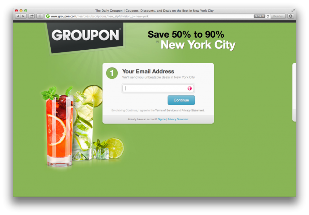
First, you can't access their content without any signup. There are a lot of startup companies that make a mistake of giving people free access to their site whether it's apartment bookings or making schedules. Often times this is a bad idea. As much as we would like it to be, if your visitor can interact with a lot of things before signing up, then he will most likely not sign up.
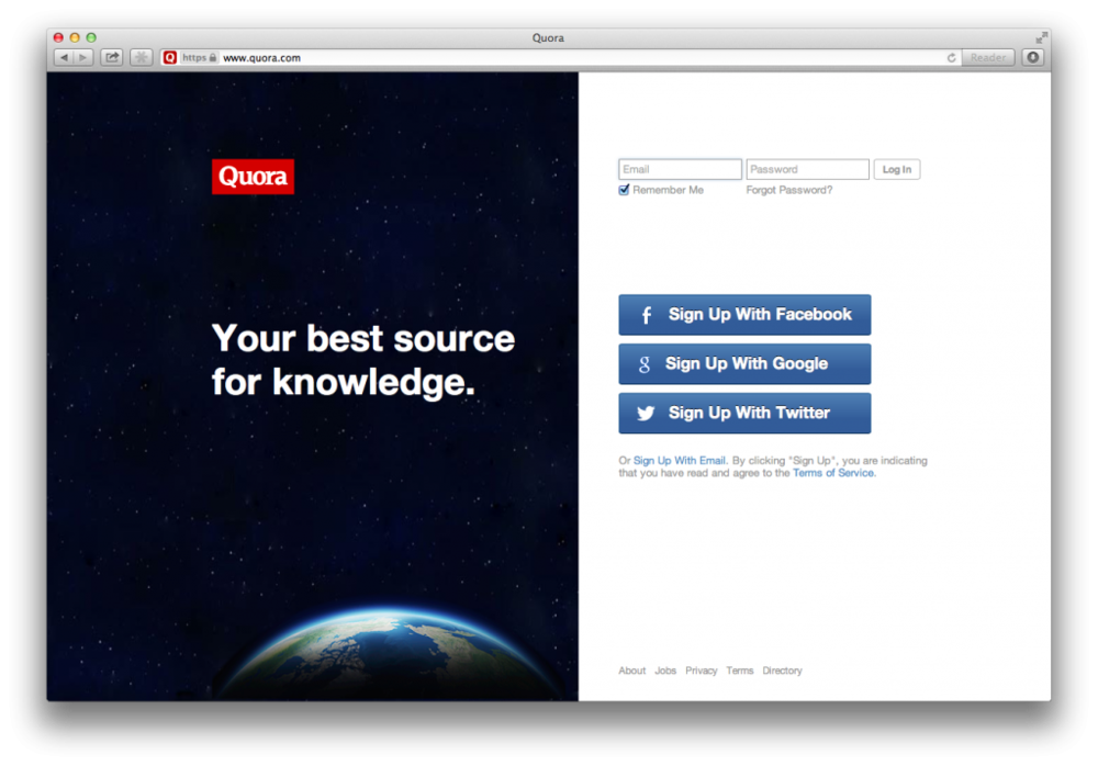
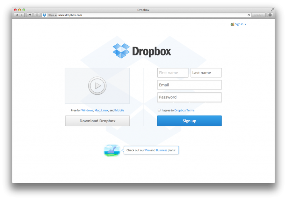
Secondly, there is an absence of many links and in many cases just a single option. For many years, many internet marketers developed this "Squeeze Page" with minimal content and a single "call-to-action". They figured out that adding more information could distract a visitor and could cause them to click away to different websites. If you notice in the snapshots of these websites, there are not many links.
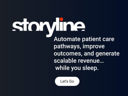
Third, focus on a single and clear value proposition. Often times, your products value is drilled down into one clear statement. It's some sort of slogan which clearly states what your product is about. Most people never read past the first sentence and it's important to get your thoughts across with just one statement or sentence. You could also consider this as your testing ground. Just change one sentence and see which one works.

Fourth, people are selfish. Contrary to popular belief, people don't share as much as everyone hopes. Most startups start thinking that people will use their product because it helps them share things more easily. Unfortunately, even people who share don't share things all of the time.
Fifth, they have big images. A picture paints a thousand words. So does a big image.
Lastly, they have embedded signup forms. Make your signup process available from the homepage so people don't have to navigate through a lot of links just to sign up. Generally speaking, the more clicks you have in your signup process, the more likely people will drop off halfway. If you notice, most of them have the signup forms in the upper right hand corner of the homepage, above the fold. Most of them rarely ask more than your name, email and password.
Whenever I tell people about these things, they say, "Everyone's already on facebook or Twitter, so I don't really have to explain what my products are about."
You're wrong.
Maybe everyone we're connected to are already familiar with Twitter and Facebook. However, we're not trying to connect to just me and you. You're trying to market your medspa or clinic to all of people who use the internet (in your area at least) and believe me when I say that not all of them have heard of Twitter or Facebook. Those are the people that these homepages are trying to sign up.
There's a lot that your medical spa can learn as a business and taking to heart what some of the fastest growing businesses in the world are doing will be time well spent. Take a look at your home page and ask yourself what your goals really are.